Built-in Sections
FilamentCraft ships 12 built-in sections, registered automatically unless you opt out. Each is a BladeSection subclass under FilamentCraft\Sections\Builtin with a curated settings schema, optional repeatable blocks, and one or more ready-made presets.
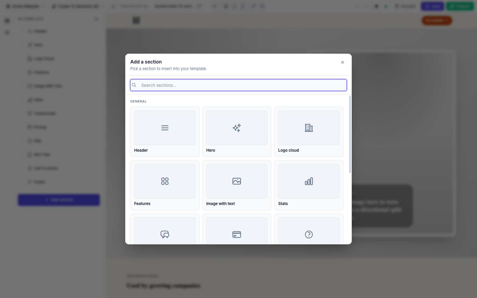
| # | Section | Slug | Icon | Blocks |
|---|---|---|---|---|
| 1 | Header | header | heroicon-o-bars-3 | nav-link |
| 2 | Hero | hero | heroicon-o-sparkles | proof (limit 4) |
| 3 | Logo cloud | logo-cloud | heroicon-o-building-office-2 | logo |
| 4 | Features | features | heroicon-o-squares-2x2 | feature |
| 5 | Image with text | image-text | heroicon-o-photo | — |
| 6 | Stats | stats | heroicon-o-chart-bar | stat |
| 7 | Testimonials | testimonials | heroicon-o-chat-bubble-left-right | quote |
| 8 | Pricing | pricing | heroicon-o-credit-card | plan |
| 9 | FAQ | faq | heroicon-o-question-mark-circle | item |
| 10 | Rich text | rich-text | heroicon-o-document-text | — |
| 11 | CTA | cta | heroicon-o-megaphone | — |
| 12 | Footer | footer | heroicon-o-bars-3-bottom-left | link |
Where to find them
The registration list lives in FilamentCraftPlugin::BUILTIN_SECTIONS; each class is in src/Sections/Builtin/. To hide or replace them, see Curating the Catalog.
Shared style enums
Most sections expose the same four EnumButtons controls, backed by these enums (each implements HasLabel, HasColor, HasIcon and offers an ::options() helper):
| Enum | Setting | Cases |
|---|---|---|
SectionShape | shape | clean, contained, layered, wireframe |
SectionDensity | density | compact, comfortable, airy |
SectionAlignment | align / content_align | start, center |
MediaPlacement | media_mode / media_placement | none, background, start, end |
Every section also exposes a ColorScheme::make('scheme') control — see Color Inputs.
1. Header
A site header with brand, navigation links, an optional CTA, and a locale switcher.
Settings: brand_text (Text), brand_logo (Image), cta_enabled (Toggle), cta_label (Text, shown when cta_enabled), cta_url (Link, shown when cta_enabled), show_locale_switcher (Toggle), alignment (Select: split / centered / compact), sticky (Toggle), show_border (Toggle), shape + density (EnumButtons), scheme (ColorScheme).
Blocks: nav-link — label (Text), url (Link).
Presets: Split Header, Centered Header.
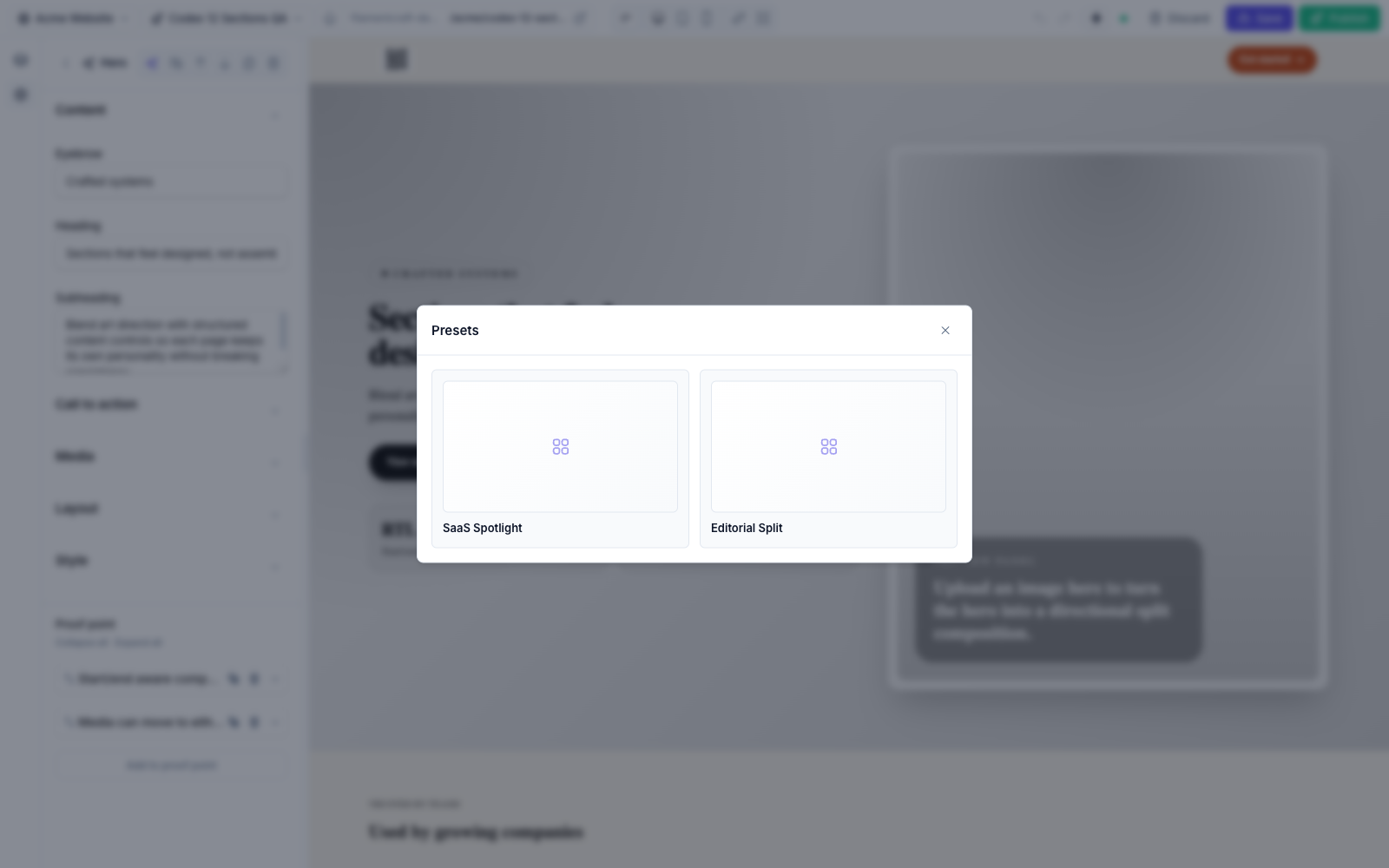
2. Hero
The flagship section, and a live demonstration of the dual-input schema (DSL settings sit next to raw Filament components like Toggle, ColorPicker, and TemplateUrlPicker).
Settings: eyebrow, heading (Text), subheading (Textarea), cta_enabled (Toggle), cta_url (TemplateUrlPicker — searches published templates), cta_label (Text), supporting_text (Text), bg_image (Image), media_mode (EnumButtons → MediaPlacement), layout (Select: spotlight / editorial / compact), content_align (EnumButtons → SectionAlignment), density (EnumButtons → SectionDensity), shape (EnumButtons → SectionShape), scheme (ColorScheme), surface_style (Select: glass / solid / none), use_accent_override (Toggle), accent_color (ColorPicker, shown when override is on).
Blocks: proof (limit 4) — value (Text), label (Text).
Presets: SaaS Spotlight, Editorial Split.
3. Logo cloud
Social-proof logos in a grid or single row.
Settings: eyebrow, title (Text), intro (Textarea), layout (Select: grid / row), align (EnumButtons → SectionAlignment), shape + density (EnumButtons), tone (Select: mono / color), scheme (ColorScheme).
Blocks: logo — name (Text), logo (Image).
Presets: Partner Grid.
4. Features
A feature grid with configurable layout, column count, and per-card icon/proof.
Settings: eyebrow, title (Text), intro (Textarea), layout (Select: cards / bands / minimal), columns (Select: 2 / 3 / 4), align (EnumButtons → SectionAlignment), shape + density (EnumButtons), scheme (ColorScheme).
Blocks: feature — icon (Icon), eyebrow (Text), title (Text), description (Textarea), stat (Text), url (Link).
Presets: Product Grid, Editorial Bands.
5. Image with text
One idea, a supporting image, and focused copy. No blocks.
Settings: eyebrow, title (Text), body (Textarea), url (Link), label (Text), image (Image), media_placement (EnumButtons → MediaPlacement), align (EnumButtons → SectionAlignment), shape + density (EnumButtons), scheme (ColorScheme).
Presets: Product Story.
6. Stats
Concise metrics in a grid or band.
Settings: eyebrow, title (Text), intro (Textarea), layout (Select: grid / band), align (EnumButtons → SectionAlignment), shape + density (EnumButtons), scheme (ColorScheme).
Blocks: stat — icon (Icon), value (Text), label (Text), description (Textarea).
Presets: Metric Grid.
7. Testimonials
Customer quotes as cards, a featured quote, or a compact list.
Settings: eyebrow, title (Text), intro (Textarea), layout (Select: cards / featured / compact), align (EnumButtons → SectionAlignment), shape + density (EnumButtons), scheme (ColorScheme).
Blocks: quote — quote (Textarea), name (Text), role (Text), avatar (Image).
Presets: Customer Proof.
8. Pricing
Comparable pricing plans with a highlightable tier.
Settings: eyebrow, title (Text), intro (Textarea), billing_note (Text), align (EnumButtons → SectionAlignment), shape + density (EnumButtons), scheme (ColorScheme).
Blocks: plan — name (Text), price (Text), period (Text), description (Textarea), features (Textarea, one per line), highlighted (Toggle), url (Link), label (Text).
Presets: Three Plan.
9. FAQ
Accessible disclosure list — no JavaScript required.
Settings: eyebrow, title (Text), intro (Textarea), align (EnumButtons → SectionAlignment), shape + density (EnumButtons), scheme (ColorScheme).
Blocks: item — question (Text), answer (Textarea).
Presets: Launch FAQ.
10. Rich text
Long-form content with an article or split-with-aside layout. No blocks.
Settings: eyebrow, title (Text), body (RichText), aside_title (Text), aside_body (RichText), layout (Select: article / split), width (Select: sm / md / lg), align (EnumButtons → SectionAlignment), shape + density (EnumButtons), scheme (ColorScheme), surface (Toggle — wrap content in a surface).
Presets: Founder Note, Editorial Essay.
11. CTA
A conversion moment as a centered card, split callout, or inline banner. No blocks.
Settings: badge (Text), heading (Text), subheading (Textarea), note (Text), url (Link), label (Text), layout (Select: center / split / banner), align (EnumButtons → SectionAlignment), shape + density (EnumButtons), scheme (ColorScheme).
Presets: Launch Card, Sales Banner.
12. Footer
A branded footer with a description, copyright, and grouped links.
Settings: brand (Text), description (Textarea), copyright (Textarea), density (EnumButtons → SectionDensity), shape (EnumButtons → SectionShape), scheme (ColorScheme).
Blocks: link — column (Text, optional grouping heading), label (Text), description (Textarea), url (Link).
Presets: Studio Footer, Minimal Footer.
Presets
A preset is a named starting point — a bundle of settings and blocks the editor can apply in one click. Built-in sections ship the presets listed above; you can define your own on a custom section by returning Preset objects from a static presets() method.
Blocks
A block is a repeatable child item within a section (a nav link, a pricing plan, a quote). Blocks have their own settings schema and an optional limit. See Custom Sections for how to declare them.